How To Judge A Book By Its Cover
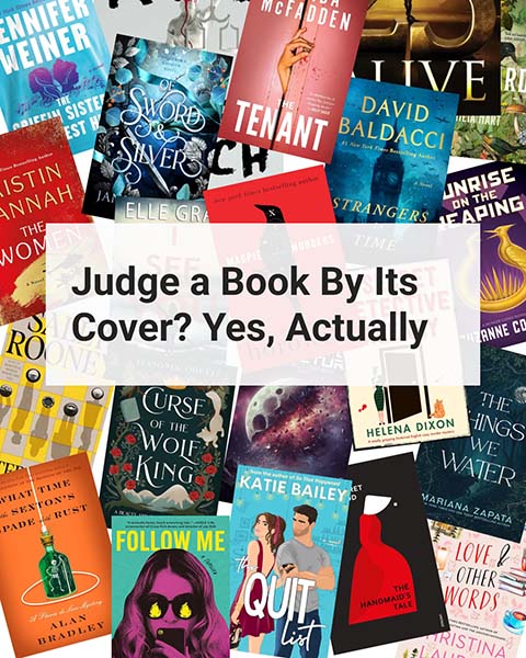
While it may be true that you should never judge a book by its cover, we all do. It is often the first thing that makes you pick up a book (or select it if online) to find out more about the content. You could go on judging books by instinct alone – there is absolutely nothing wrong with that. But you have found yourself here, reading this blog post, so perhaps you want to take a more cognitive approach to this task. The following are a few things you can look for to help you articulate why you judge a book’s cover the way you do. Perhaps it will even change the way that you look at books. We’ll talk vocab – you are gonna sound so smart – and then inspect how it affects what we might think about the book. Lets dive in:
This post may contain affiliate links. If you click on them and make a purchase, I may earn a small commission at no extra cost to you.
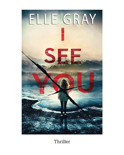
Genre Signaling
What is genre signaling?
“Genre signaling” is the use of recurring elements in design to indicate the type of text, helping readers understand and categorize it quickly.
What does genre signaling tell you about a book?
Book covers commonly use conventions (dare I say tropes) to help a person quickly identify what type of story is within the pages. These visual cues include images, colors, type styles, and overall design layout or style.
Genre signals can help a book cover instantly gain a potential reader’s trust that the author has written something that aligns with genre expectations and may be potentially enjoyable to the reader.
Graphic Design
What is “graphic design”?
“The art or profession of visual communication that combines images, words, and ideas to convey information to an audience, especially to produce a specific effect.”
What does graphic design tell you about a book?
How images and type are arranged influences the genres signaled, using many other elements discussed here: color psychology, typography, white space, hierarchy, visual references, and even puns. There are innumerable ways to combine all of these different aspects. Designers use various principles of art and design to help make all of these things work together to deliver a clear message about the intent of the final design (in this case, a book cover).
I should point out that this goes beyond the front cover and affects the spine and back cover. Let’s not forget any books that might be part of a series…how they are similar enough to know that they belong together, but different enough to tell them apart. There is a lot of education and skill involved.
Hierarchy
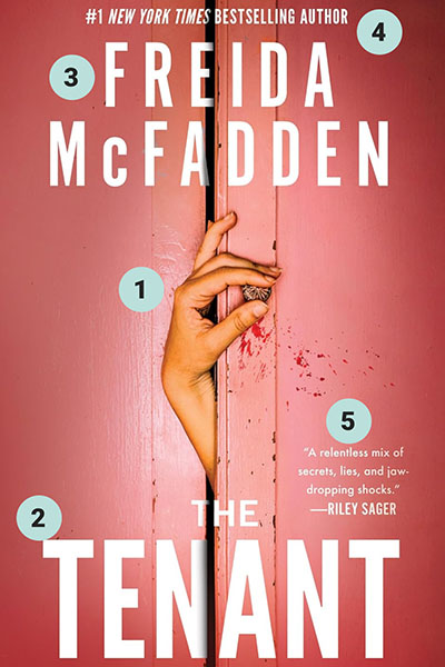
What is hierarchy?
”Hierarchy is any system of persons or things ranked above one another.” Sure, that makes sense…like a deck of cards King, Queen, Jack, 10, 9… or the CEO outranks the SVP and so on.
What does hierarchy tell you about a book?
On a book cover, the hierarchy is about the order in which your attention is drawn to things. The first thing your eyes notice is the highest ranking, then the next thing, and the next. So if the first thing you see is the picture, that is the thing that carries the most importance. Or if, perhaps, the author’s name is the biggest, boldest thing on the cover, then the designer or publisher is sure that the author’s name plays a large role in your desire to read that book.
Typography
What is “typography”?
“The general character or appearance of printed matter.”
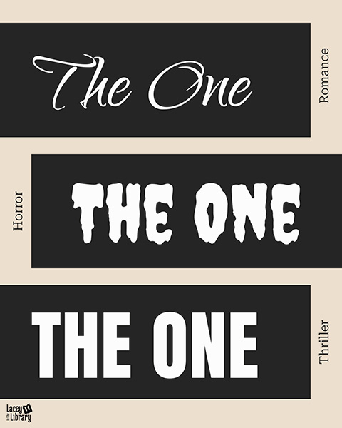
What does typography tell you about a book?
Typefaces communicate information and contribute to storytelling. They say that every typeface has a personality. Imagine this headline applied in these different type styles and what each tells you about the book you are considering:
Typography also extends to your experience well beyond the cover design. The entire book (physical or ebook) is typeset so that you can read it comfortably, the beginnings and ends of sections are clear, dialogue is distinguishable from other text, footnotes, endnotes, references, and all of the typed out things! Have you ever read a book that was difficult to read because of the typeface? Or been delighted by some special aspect of the book’s interior? I talk about this type (pun intended) of thing in my book reviews.
Whitespace
What is “whitespace”?
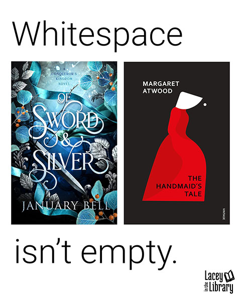
Whitespace is where there is no visual element. This allows your eye to rest and gives more emphasis to the places that do have visual elements.
What does Whitespace tell you about a book?
Books with a great use of whitespace tell me instantly that they have a professional designer behind the scenes who feels confident about the message they are sending about the book. This element isn’t always super noticeable, and that is on purpose. However, next time you set out to judge a book cover, look for it. See how it impacts the rest of the design.
Color Psychology
What is “color psychology”?
Color psychology refers to how individuals understand that certain colors convey certain meanings. This is a largely cultural phenomenon, and a color can mean one thing to one group and something completely different to another. For example, in the US, white conveys innocence or purity and is the traditional color of wedding dresses, whereas in other parts of the world white signifies death and mourning.
What does color psychology tell you about a book?
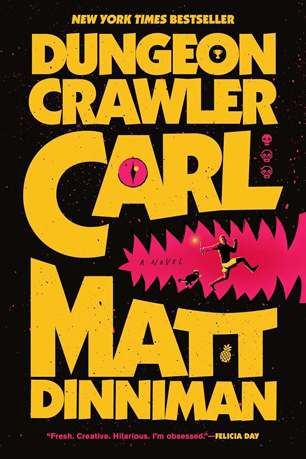
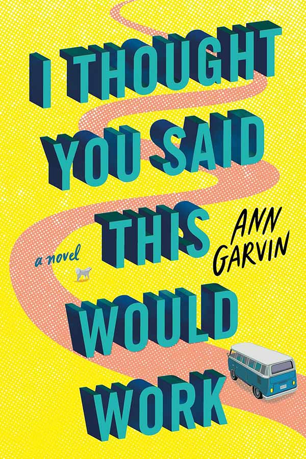
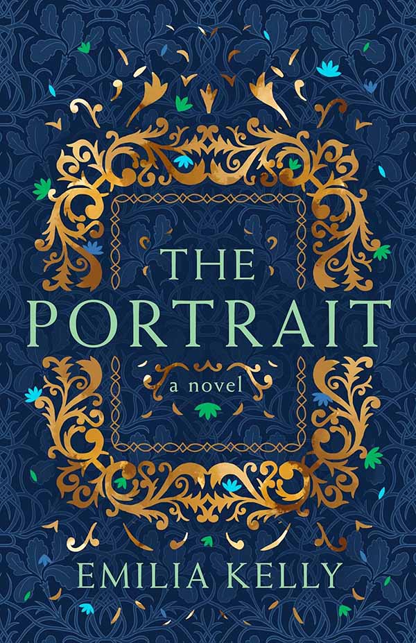
A part of genre signaling, colors can help a book cover to properly show what the feeling of a story might be. Certain combinations are indicative of specific genres. For example take a look at these titles:
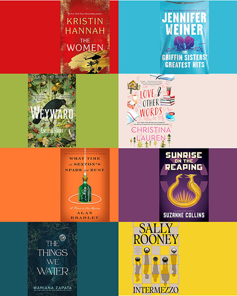
While there are always exceptions, you may find that if you have a strong preference for a particular type of book, your shelves may be heavily populated by a specific color or combination of colors.
Visual References
What are “visual references”?
This is when the design calls out about something familiar to fans of a genre, also called easter eggs. This is often a pop culture reference or something that is specific to a particular genre.
What do visual references tell you about a book?
Visual references can be large genre signals. For instance, a romance novel retelling a classic fairy tale might include elements from that original story to help you understand that it is a retelling (i.e., a Beauty and the Beast story might show an image of a red rose). Or they can be there to signal a setting (i.e., images of the white house would signal Washington, DC, and may indicate that the book is about government in some way).
Visual or Literal Puns
What are “puns”?
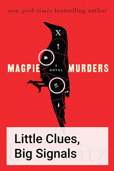
“The humorous use of a word or phrase so as to emphasize or suggest its different meanings or applications, or the use of words that are alike or nearly alike in sound but different in meaning; a play on words.”
What do puns tell you about a book?
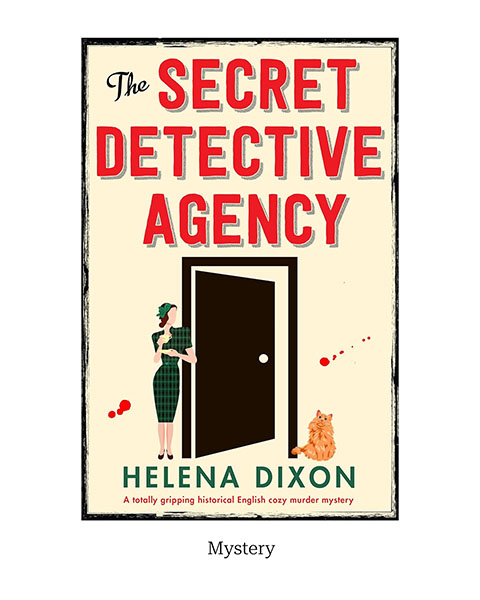
Puns add a touch of humor or whimsy to a cover to let you know that the read will have some witty elements. This is very common in the “cozy mystery” genre.

Questions For Further Judgement
Does the book cover engage you as a reader?
If not, you might not want to go down that path. If you don’t like it now, you probably won’t want to look at it on your shelf later. Still want to (need to?) read it, no prob. Check out ebooks, audiobooks, or your local library!
If it is a series, does it match the other books in size, color scheme, design elements?
This doesn’t necessarily matter if you are a hard core ebook or audiobook reader. However, for readers who love a physical copy, is it going to piss you off that you have the first one in paperback but cant wait that long to read the second so you bought it in hardcover? The struggle is real? How many copies is too many?
Does the books format meet your needs?
This might seem like a strange question, but hear me out. If I think I might like to read a book, but am not sure that I will love it, or it’s outside my normal taste, or the cover doesn’t appeal to me, I will get it as an ebook or listen to the audiobook. Shelf space saved for more books later. But if a book is just a knockout, it might be worth splurging on a special edition hardcover that will look gorgeous on display.
You Be The Judge
No matter what, you are in charge of your reading adventure. Don’t let anyone make you feel bad about your reading choices.
I’d love to hear from you readers about how this knowledge changes (or doesn’t change) your approach to book selection. Let me know in the comments!
May your life be as full as your bookshelf and as long as your TBR list.
Happy Reading!



0 Comments