A fun and honest review of Dungeon Crawler Carl, the wildly popular LitRPG about aliens, dungeon survival, and a sarcastic cat. Includes cover design critique.
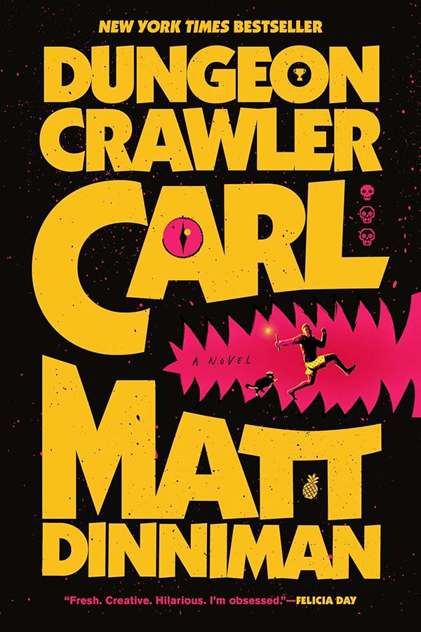
A fun and honest review of Dungeon Crawler Carl, the wildly popular LitRPG about aliens, dungeon survival, and a sarcastic cat. Includes cover design critique.
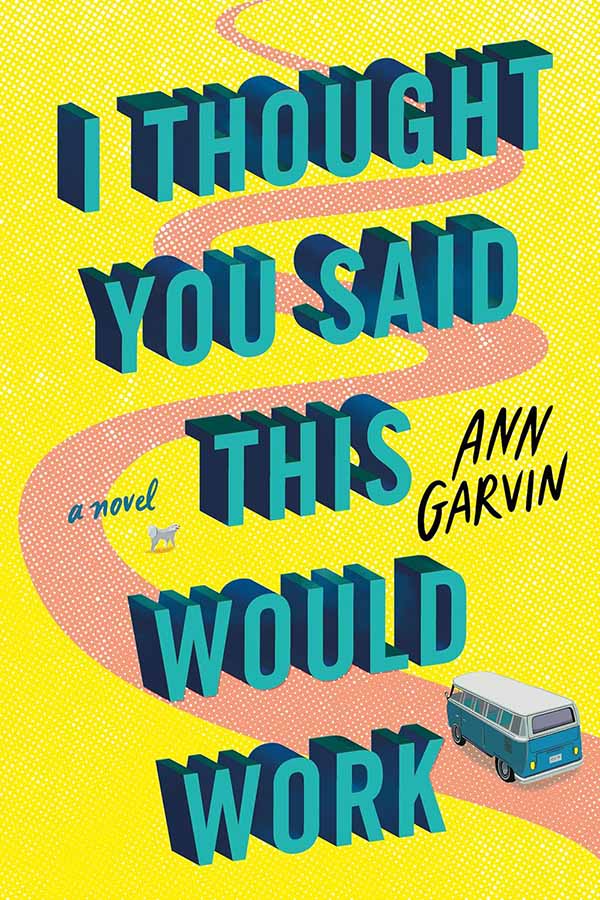
A thoughtful review of I Thought You Said This Would Work by Ann Garvin, exploring the cover design, character development, and themes of friendship, healing, and second chances.
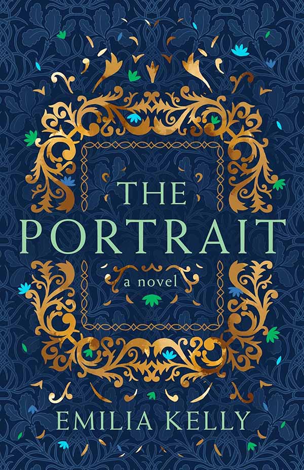
A thoughtful review of The Portrait, a Victorian historical mystery exploring art, love, and secrets. Includes cover analysis and design critique.
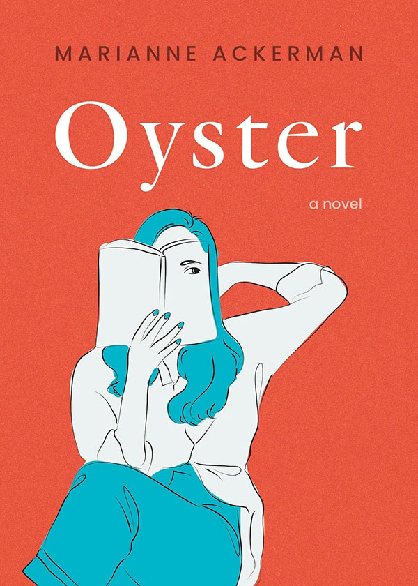
A spoiler-free Oyster review analyzing its striking cover design, satirical publishing themes, family drama, and slow pacing. Is this quiet literary novel worth the hype? Honest thoughts inside.
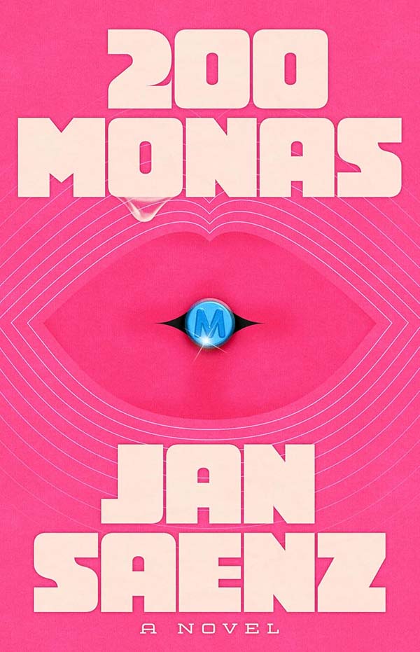
A spoiler-free 200 Monas review exploring its bold cover design, feminist themes, grief narrative, and chaotic 48-hour plot. Full analysis inside.
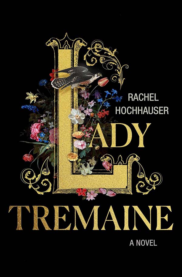
A feminist Cinderella retelling told from the stepmother’s perspective, Lady Tremaine explores motherhood, female agency, and patriarchal power. Read a full review, cover design analysis, character breakdown, and why this gritty fairytale reimagining is one of 2026’s most anticipated releases.
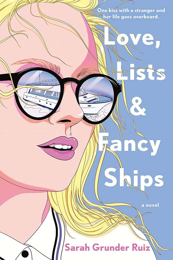
A spoiler-free review of Love, Lists & Fancy Ships, a character-driven, no-spice romance about grief, friendship, bucket lists, and slow-burn love set against summer yacht vibes.
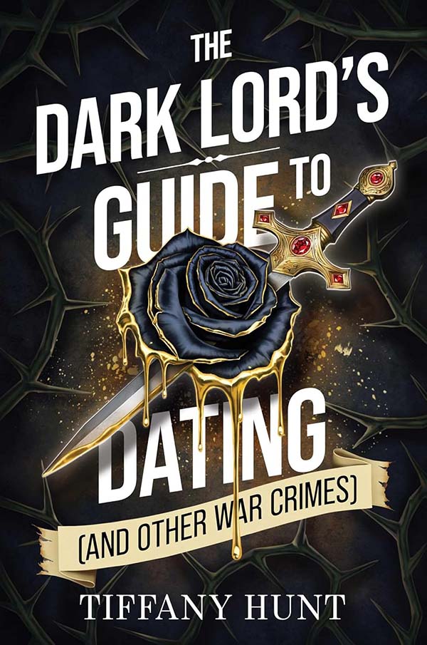
A spoiler-free review of The Dark Lord’s Guide to Dating, a dark romantasy packed with forced marriage, sharp humor, sizzling spice, and villain POV chaos. Out March 2026.
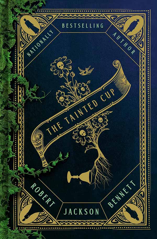
A spoiler-free review of The Tainted Cup by Robert Jackson Bennett, a Hugo Award–winning fantasy murder mystery featuring a Holmes-style detective duo, immersive world-building, and layered political intrigue.
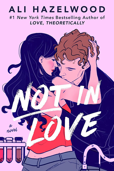
Spoiler-free review of Not In Love by Ali Hazelwood, explores the book’s design, characters, tropes & emotional themes. Is the hype real—or just good marketing?