

How Book Covers Affect The Reader Experience
You’ve probably heard the old adage, “Never Judge a Book By Its Cover,” and while that might be sound advice, it’s hard to separate yourself from the influence of your own subconscious. Even when we try our very best not to pass judgment, our brains take in an incredible amount of information and parse it before we can even blink. Let’s explore what we learn from a book’s cover.
This post may contain affiliate links. If you click on them and make a purchase, I may earn a small commission at no extra cost to you. As an Amazon Associate I earn from qualifying purchases.
Genre Signaling
Have you ever noticed that books within a genre have a similar look? Give off that vibe. That’s so you can easily identify books in your favorite genres quickly by sight. You can make a beeline straight to where you want to be because you can locate at a distance books that look “right” for the category.
What happens when a book doesn’t have the genre signals? It may be overlooked or may have to rely on other elements in the design to communicate its value to the reader. On the other hand, books that have very strong elements (for example, a very well-known genre author) might be able to get away with an uncharacteristic look for their cover.

Screenshot from amazon.com showing book covers for Under Her Care by Lucinda Berry, Catch Her Death by Melinda Leigh, Ushers by Joe Hill, Seizure by Kathy Reichs and Brendan Reichs, Lie to Her by Melinda Leigh, The Big Dark Sky by Dean Koontz, Faithless by Karin Slaughter, and Phantom Limb by Lucinda Berry.
Above is an image of some book covers that showed up when I was browsing a popular book shopping website and filtered by the category “Thrillers.” While I have not read any of the books above, my eyes immediately believe most of these are, in fact, thrillers. One, however, looks much more like a sci-fi thriller book than a general thriller, so if I were choosing a general thriller, I would overlook that item, but if I were in the mood for something sci-fi leaning, it would stand out as the obvious choice to learn more about. Can you guess which one I am talking about? Does it look the same to you?
Building Expectations
When a reader picks up a book that has caught their eye, it immediately begins to build expectations about what the book might be about, the tone it might take, and we begin to make judgements about whether or not that book is “for us” before we even read the blurb.
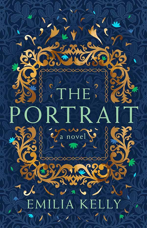
I have not read the book featured below, nor read the description, nor am I familiar with the author. Looking at the cover, I would make some assumptions:
- Probably a historical setting between Greco-Roman and Medieval, or in another “world” based on swords, spears, and shields. Upper and lower wing-like elements make me think of fantasy.
- Fantasy / paranormal leaning, based almost entirely on the color and font choice.
- Likely to be very battle-focused and bloody, based on both of the above in combination with the title and teaser text.

Book cover of Malice by John Gwyne
Has anyone in the readership read this book? Can you confirm or deny my assumptions?
Plot Hints
Many book covers use visuals to hint at plot elements or character traits that might entice the reader to continue. These might even happen subconsciously! Our brain works so quickly to interpret our surroundings that you might not even realize why you are excited by or put off by a book when you haven’t even read past the title.
I have not read the book pictured below, but it is giving “Twister.” I would assume that it is set in the American Midwest in the present day, the plot is driven by tornadoes, and the main characters fall in love. Not exactly rocket science, eh?

Book Cover of Whirlwind by Kayla Grosse
Author Brand
The author’s name might sway your decision to continue or not. Is it a name you know? Have you read their work before? Do you see their name in the news or on social media? Is the author’s name larger than the title? Does the book tout the author as “best-selling”? This is a signalling value to you, the reader, about how you can trust that the author writes books that people like. What about that author name…the one you like so much, the cover could be blank except for their name and you’d buy it anyway?
I’m guessing that is the case with this book:

Book cover of Charlie Martz and Other Stories: The Unpublished Stories by Elmore Leonard
I am unfamiliar with Elmore Leonard, but clicking through to the description of this book tells me he is an “American Master” of crime writing. Fans of the author wouldn’t need much more than the name and the fact that this book contained previously unpublished stories to scoop it up, and that is all they get. This cover gives little indication of what the reader might find inside.
I imagine authors like Stephen King or Isaac Asimov have a similar sway with their respective audiences. Who is an author you love and will *always* buy their books?
Social Proof
Testimonials, praise, or accolades for the author or book give you social proof that makes you more likely to trust that this will be a good book. Those items, whether or not you read the contents, can affect whether or not you believe a book will be good enough to purchase. Awards, in particular, will help some readers to make decisions. When my children were young and I would buy them books, having a Caldecott or Newbery award sticker on the front of the book was often a good indicator that it would be a valuable reading experience for my kids, and suggest they would probably like the story.
This book showcases a line of praise from a screenwriter and director of well-known films. It mentions their work so you associate this book with the kind or quality of work listed.

Book cover of Follow Me by Elizabeth Rose Quinn. The praise line reads:”’A wickedly funny, heart-wrenching tale.’ -Adele Lim, screenwriter of Crazy Rich Asians and director of Joy Ride”
Color Psychology
Color can indicate a lot about things in our lives and while that can shift culturally, we use color to make assumptions about books all the time.
Pattern Recognition
Layouts hint whether a book is for us. Certain illustration styles or images combined with a certain typeface can act as clues to help suss out just the right book among a sea of possibilities.
Context Matters
It might seem obvious, but seeing a book independently, like on a computer screen on a page dedicated to a single book, is very different from wandering through a bookshop where covers compete for your attention.
Next time you are in a bookshop, take a moment to pause and truly experience the wonder that is this cacophony of visual noise.
- Do you head straight for your section and seek a specific book spine by spine?
- Are you drawn to the wall of front-facing new releases?
- Does your hand gravitate toward the stacks of books on a table?
- Are end-caps your jam? Or do you prefer the quiet perusal of an online shop?
- Or getting recommendations from your local librarian?
How you find your next book will also impact your experience with it.

Cover Copy
The first taste. Titles and supporting copy on the front of a book can make or break a purchase decision. Have you ever been in a bookshop and been lured to an area by an interesting cover, only to read the title and say “nah”? Or picked up an otherwise unremarkable cover just because the title called out to you? Let’s not for get about the magic word “bestselling.” Yeah, it all counts.
The Description
The meat and potatoes in the purchase decision. They have pulled you in with the cover, the title, the author’s name, but will they keep you? Chances are, if they can pique your interest enough, that book is coming home. The teaser copy may not even be written by the author of the book. This is marketing copy. It is designed to work in tandem with the cover art and all of the accolades to draw you in to seal the deal.
Buy it or Leave it?
After you have perused and evaluated the book cover, you make a judgment call – is it for you?
Let’s assume you buy the book. When you get around to reading it, you bring all of those snap judgments and assumptions, along with anything you might have seen or heard about the book or the author, into the reading experience. Does the book live up to what you believed it to be? Disconnection between your assumptions and the content can be jarring and harm how you perceive the book. I’ve read plenty that looked like they might be great, only to be utterly disappointed. On the other hand, you can sometimes be pleasantly surprised. I have read books I thought would be “meh” which ended up pretty good.

Why Does It Matter?
Why does it matter that we understand how book covers influence our decision to read a book or not? So that we can be conscious about what we do with that information. Do you only want to read books that are a “sure thing,” or are you willing to take a chance on an unknown? This is all for you, reader! But knowing where our preconceived ideas about a book are coming from can help us to make better purchase decisions or to suspend our judgment, knowing that we were influenced by the cover designer’s voodoo magic.
Aside from the reading experience, the cover might play into other reader concerns, such as how this book (aka reading trophy) looks on my shelf. What does it say about me, the reader? Does it fit with my own self-perception? What will other people think? Is this pretty enough to display? Would I rather read this in another format (ebook, audiobook – post about this)? Is it worth buying in hardcover, or will paperback be more appropriate? (link to article about how the cover design might influence the book format we consume).
A book displayed within the home or office is more than a trophy of your reading experience; it is a touchstone to the content. It provides a reminder of what you felt and experienced, or what you learned or how you were affected by the book. Just looking at it or holding it can temporarily bring back another time and place within your own life, or transport you to the world within and what you experienced there.
In a way the cover of a book works in the same way that a beautiful presentation enhances the flavor of a meal. All of your senses work in tandem to create a lived experience. Since so much of what we get from books is visual, the cover design often has a larger impact on the way we feel about the book than we might assume. The only way to truly not be affected by a books cover is to read books that have no cover…and where is the fun in that?!
Tell me in the Comments:
What affects your book-buying decision the most?
May your life be as full as your bookshelf and as long as your TBR list.
Happy Reading!


0 Comments